
 Reserve with Google
Your website is the hub of your business.
While getting enough traffic is a necessary part of business growth, equally important to that business growth is actually converting those visitors – getting them to actually take action.
That’s why website design is so important. It plays a massive role in those conversions, likely much more than you even realized.
Remember, a beautiful website isn’t just aesthetically pleasing; it must be designed in a strategic way that guides visitors through your website so that they make the kind of decisions you want them to, whether that means signing up for your newsletter or making a purchase.
While there are certainly many different elements of a high converting website, the foundation is having a user-friendly design.
Whether you are just getting your website up and running or perhaps your website is not converting in the way you want it to, this article will take you through how to create a beautiful website that converts.
1.Usability
The foundation of a website that converts is its usability, which means that your website is easy to use. In fact, improving usability can increase your conversions by as much as 83%.
Ultimately, when a visitor lands on your website, you want them to easily be able to find what they’re looking for (this is related to user experience and is also important; in other words, search bars are key), while also directing them to the most important aspects of your website, whether that’s your product page or a lead generation form.
Knowing your visitors and knowing what they want is at the heart of usability. Of course, there are a lot of elements of usability, but here a common few.
- Simple, Intuitive Navigation
Make your site’s navigation simple and intuitive; keep navigation at the top of the page as well as in the footer. You should also keep navigation options to a minimum, otherwise users can fail to act altogether, a well-known psychological phenomenon that more isn’t always better.
The famous psychological study, “When Choice is Demotivating” found that people were one-tenth as likely to purchase jam when there were too many choices as when there were fewer choices.
In general, you will make your website high in usability if you don’t stray too far from convention. That means keeping your navigation at the top of the page, as mentioned, as well as things like ensuring your logo is at the top left of the page and other similar conventions that we’re used to.
- Fast Page Speed
A page that loads too slowly will have people clicking the ‘X’ button faster than you can shake a stick at. Page load speed is also a Google ranking factor, so don’t overlook its importance.
You may have heard that ugly websites convert better. That’s partially true. Here’s why.
Some beautiful looking websites tend to favour GIFs and other fancy features that won’t show up for some users due to the browsers they’re using or because they’re using Flash, which slows down the website.
While your website should be aesthetically pleasing, it shouldn’t come at the cost of slow loading time.
- Responsive Design
You may have heard that for the first time in history, smartphone searches have officially outnumbered desktop searches. It is now more important than ever to ensure that your website has a responsive design and that your website can adapt to any screen size.
2. Excellent Visual Hierarchy
In web design, the term ‘visual hierarchy’ is one you hear a lot. It’s important, which is why we’ve given it the second spot on this article – in a way, there’s a practical example of us utilizing visual hierarchy in this very article.
Good visual hierarchy is all about drawing attention to the most important aspects of your website. There are many different ways in which visual hierarchy can be applied, but size is a big one. The more important something is, the bigger it should be in size.
Colour is another important element. Contrasting colours, for example, can be used to draw attention to your calls-to-action and other important aspects of your website.
Whitespace is another important aspect of visual hierarchy.
Whitespace, also typically referred to as negative space in web design, refers to the empty space on your website.
Whitespace is aesthetically appealing to us (we don’t like clutter), but it is also functional: it draws attention to the most important aspects of the website, which is essential to conversion.
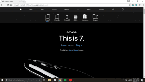
Some websites use a lot of whitespace. Take a look at Apple’s homepage.
.
For a more in-depth look at the building blocks of visual hierarchy, take a look at this article, here.
A quick note about whitespace while we have you here: remember that the most important aspects of your website – your value proposition and a call to action – are always present above the fold, which is the part of your website that is visible without needing to scroll.
At the end of the day, ensure that your website has good visual hierarchy, that it is designed in a logical way that makes the most important parts of your website (calls-to-action, for example) stand out.
Think about the purpose of every page of your website and then design it with visual hierarchy in mind. If you do that, you are off to a good start.
3. Clear & Strong Calls To Action
Calls to action are arguably the driving force of your website. Who says they can’t be beautiful? Sure, they aren’t directly related to a beautiful website, but they are such an important part of conversion that we couldn’t overlook them.
In general, they should be clear and strong. Take a look at Mozilla Firefox. They increased their conversions when they swapped “Try Firefox 3” with “Download Now – Free.” It’s much stronger, clearly conveying the benefit to the user.
Above all else, remember this: testing your CTA’s – in fact, testing all aspects of your website design – is key to maximizing conversions.
4. Keep The F-Shape In Mind
Studies have shown that people follow an ‘F’ pattern when reading websites, beginning first at the top right of the screen and moving to the left. Then, they scan the remaining part of your website, briefly looking into the middle of the screen. Use this to your advantage.
Place the most important parts of your website – for example, calls to action – along the F shape. Since your visitors will typically look at the top right-hand side of the page, you might want to place a call to action there.
For reference, the part of the screen that receives the least amount of attention is the bottom right. This would be a good location for items that are of lesser importance.
5. Benefit-Driven Copy, Value Propositions
Copy is important when it comes to conversions. And there is nothing more beautiful than benefit-driven copy – that is, text that specifically emphasizes its benefits to the visitor.
Your value proposition is a small piece of text, generally no longer than a typical headline, that clearly communicates the benefit or value of your product or service, such as why your particular product or service is useful.
This is absolutely essential to have on your homepage, but it really applies to all pages of your website. Speaking of home pages, these are one of the most important parts of your website and need a lot of extra attention.
Here is how you can optimize your homepage in order to boost conversions.
You need to be clear and you need it to be obvious. Going back to the part about visual hierarchy discussed above, you would make this chunk of text larger since it is one of the most important; perhaps you would use contrasting colours to draw attention to it. You get the idea.
Another important aspect of a high-converting website is effective landing pages. If you missed it, we’ve covered the art of creating high converting landing pages before, which you can read here.
6. Include Videos
Videos increase conversion, plain and simple. A great way to include videos is on your product or features pages.
Another great location for videos is on your homepage; DropBox increased their conversions by more than 10% when they did it.
7. Keep it Simple Above All
There is nothing more beautiful than a website that makes things easy and simple. This premise can be applied to virtually every different aspect of your website.
ProFlowers, who is known for their high conversion rates, is a great example of this.
They make it easy for users to make purchases by eliminating buyer fears and, specifically, answering FAQs above the fold headline.
In wrapping all of this up, remember this: have priorities for each page. Whether you want your visitors to sign up for something or make a purchase, guide them to it.
It is also important to know your visitors; although you may not have any traffic yet, this will be key to ensuring that your visitors have a positive experience on your website. Then, make it easy for visitors to find what they want. Keep your website uncluttered and easy to navigate.
Remember also, that a beautiful website that converts is something that you have to stay on top of – you always need to be testing everything.
Here are some free tools to test your website usability and responsiveness.
At the end of the day, there are a lot of elements that are necessary to conversion, but effective website design that blends both aesthetics and strategy is at the forefront of increasing your business growth.
But, if you don’t have a website or you’re not converting as much as you want to, don’t worry. You can easily get started by signing up with Yocale (we offer the best online appointment scheduling software) and receiving a custom Yocale profile, which acts as a Google optimized mini-website.